The Deficit Crisis Is Really A Recession Problem
요약:The graph below provides a clearer understanding of the US fiscal deficit.First, focus on the red li
The graph below provides a clearer understanding of the US fiscal deficit.
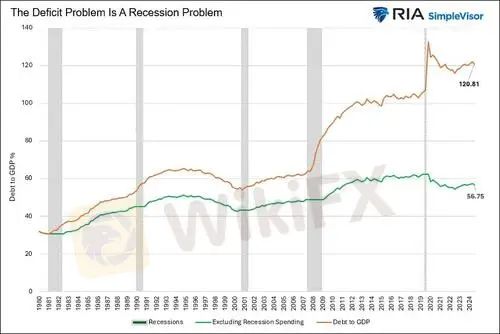
First, focus on the red line below, graphing the ratio of federal debt to GDP.
Note that it is at the same level today as it was in 2021. Similarly, before the pandemic, it had been relatively flat for seven years. This highlights that the deficit problem we have today was exacerbated by recession-prompted fiscal stimulus and the temporary decline in GDP.
To illustrate this more clearly, we created the green line.
This version of the debt-to-GDP ratio assumes zero change in the ratio during recessions. Moreover, it uses the same growth rates as the all-inclusive debt-to-GDP ratio to calculate the growth for periods outside of recession.
As the green line indicates, the ratio today is the same as it was over 10 years ago.Furthermore, it is close to levels seen in the mid-1990s. The takeaway from comparing the two lines is that the ratio of debt to GDP follows a stairstep pattern.
Its generally flat during periods of growth, while it accelerates during recessions.
The point in playing with the data is not to belittle the deficit problem. Instead, we think its essential to acknowledge that the deficit problem is primarily associated with recessionary stimulus. Thus, maybe we should consider how we spend stimulus funds during recessions. In particular, might a focus toward productive stimulus during recessions provide a greater long term economic boost?
Still, if there is no recession in the near future, we might find that todays deficits are not significantly worsening as some pundits lead us to believe.
Might they be too focused on the deficit amount stated in dollars, rather than as a ratio to our ability to pay for it, i.e., economic growth?
면책 성명:
본 기사의 견해는 저자의 개인적 견해일 뿐이며 본 플랫폼은 투자 권고를 하지 않습니다. 본 플랫폼은 기사 내 정보의 정확성, 완전성, 적시성을 보장하지 않으며, 개인의 기사 내 정보에 의한 손실에 대해 책임을 지지 않습니다.
WikiFX 브로커
최신 뉴스
[이벤트 사전 예고] 주간 모의투자 대회가 돌아왔습니다! 매주 최대 300달러 리워드까지 도전해 보세요
 WikiFX
2025년 최신 리뷰! PU PRIME, 믿고 써도 될까? 실사용 후기와 꼭 알아야 할 주의사항
WikiFXFX 브로커 전용 통합 관리 시스템, 2개월 무료 체험 제공!
WikiFX환율 계산기