The Deficit Crisis Is Really A Recession Problem
概要:The graph below provides a clearer understanding of the US fiscal deficit.First, focus on the red li
The graph below provides a clearer understanding of the US fiscal deficit.
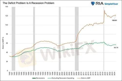
First, focus on the red line below, graphing the ratio of federal debt to GDP.
Note that it is at the same level today as it was in 2021. Similarly, before the pandemic, it had been relatively flat for seven years. This highlights that the deficit problem we have today was exacerbated by recession-prompted fiscal stimulus and the temporary decline in GDP.
To illustrate this more clearly, we created the green line.
This version of the debt-to-GDP ratio assumes zero change in the ratio during recessions. Moreover, it uses the same growth rates as the all-inclusive debt-to-GDP ratio to calculate the growth for periods outside of recession.
As the green line indicates, the ratio today is the same as it was over 10 years ago.Furthermore, it is close to levels seen in the mid-1990s. The takeaway from comparing the two lines is that the ratio of debt to GDP follows a stairstep pattern.
Its generally flat during periods of growth, while it accelerates during recessions.
The point in playing with the data is not to belittle the deficit problem. Instead, we think its essential to acknowledge that the deficit problem is primarily associated with recessionary stimulus. Thus, maybe we should consider how we spend stimulus funds during recessions. In particular, might a focus toward productive stimulus during recessions provide a greater long term economic boost?
Still, if there is no recession in the near future, we might find that todays deficits are not significantly worsening as some pundits lead us to believe.
Might they be too focused on the deficit amount stated in dollars, rather than as a ratio to our ability to pay for it, i.e., economic growth?
免責事項:
このコンテンツの見解は筆者個人的な見解を示すものに過ぎず、当社の投資アドバイスではありません。当サイトは、記事情報の正確性、完全性、適時性を保証するものではなく、情報の使用または関連コンテンツにより生じた、いかなる損失に対しても責任は負いません。
WikiFXブローカー
話題のニュース
2ヶ月無料で使い放題!FXブローカー向け製品パッケージ、必要なツールを自由に選べる、サブスクリプション型ソリューション
 WikiFX
金融庁、仮想通貨を「金融商品」として再分類へ
WikiFX【2025年上半期まとめ】分散投資戦略がS&P500を超えた理由と注目資産ランキング
WikiFX今週、日本人ユーザーが最も検索されたFX会社まとめ[6月27日]
WikiFXSNSで出会った彼に騙された…ロマンス詐欺×Euronext偽サイトの手口とは
WikiFXついに再始動!「WikiFXデモトレード週間コンテスト」開催決定!
WikiFX新台湾ドル、対米ドルで約3年ぶりの高値水準に
WikiFXレート計算